
A few quick graphs show that Australia’s flu season is active now; it’s later than it used to be, just after the pandemic’s peak, and is straying into early Spring like it used to. It’s A(H3N2)-driven, but it’s also a bit smaller than we’ve been used to. So far.
Back in June, I’d guessed that Australia might see a flu epidemic peak in July/August, which would mean a return to a normal flu-season epidemiology, with the season commonly peaking after July. ‘Normal’ meaning pre-pandemic because flu seasons had shifted to earlier, often bigger and sometimes longer seasons in the years after our COVID-19 interventions were lifted.
Well, in the last couple of days, what looked like a plateau in daily cases bumped up a little, then dropped back down, and so it looks like Australia may have peaked in August – or at least, not in June/July. That makes #Flu2026 a little more like the old normal. At least so far – we’ll need to watch what happens in September, the end of which will see schools out across the country for spring holidays (starting 19th or 26th of September depending on jurisdiction).
Daily flu detection differences
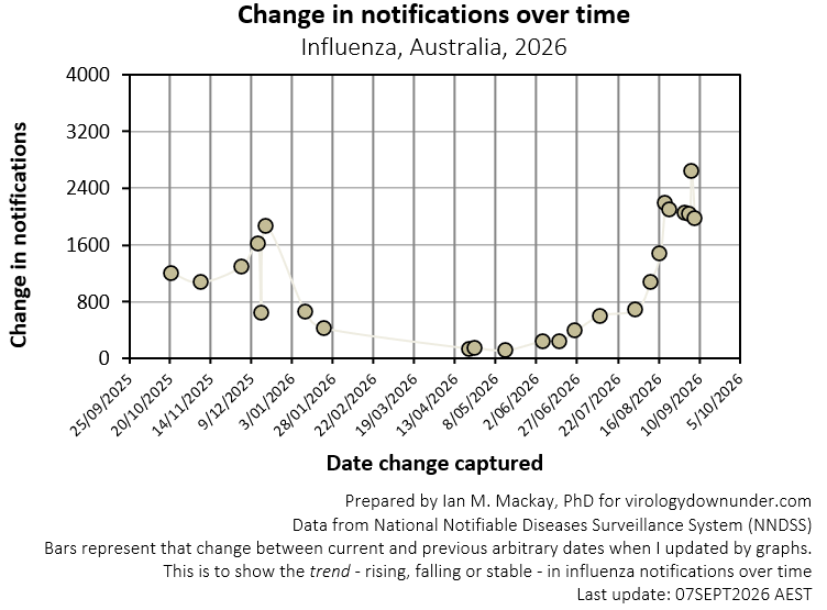
The graph below shows the change in the average “cases per day” for each of my social media posts about flu, compared to the previous post’s average. Apart from one bump up, the peak appears to have been fairly stable, averaging 2,066 cases per day over five days.
Click on the image to enlarge.
How does this compare to previous years in Australia?
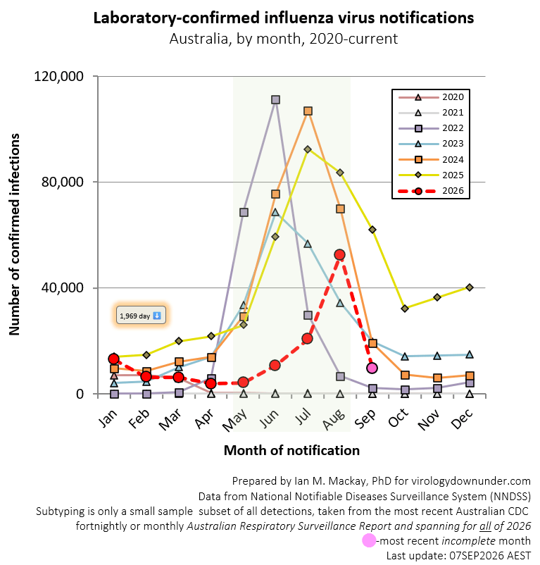
If we zoom out and look at this in the context of previous years, we can see that 2026 remains a small year so far, having its greatest activity – so far – after the peaks of any of the immediate post-COVID-19 flu seasons but right in amongst the influenza-of-old.
Click on the image to enlarge.

Click on the image to enlarge.
Is Australia’s flu season severe?
New Zealand has been suffering a rough flu season, with political decisions meaning staffing levels have been insufficient and vaccination has been less freely available. But it has also experienced the highest level of severe acute respiratory illnesses (SARIs) since at least before 2021. As I recently wrote, averaged data for 2015-2019 isn’t good enough because it dilutes the impact of a very big 2019 flu season (make public health data freely available, guys!).

Click on the image to enlarge.
Australia’s fortnightly national report – the Australian Respiratory Surveillance Report (ARSR) – dropped at the end of last month but only covered up until the 23rd of August. Much has changed.
That report noted a rise in self-reported influenza-like illness (ILI) in the community and in ILI-related presentations to general practitioners. In sentinel hospitals, admissions with acute respiratory infections decreased; however, their intensive care admissions with SARIs increased in the severity reporting period (29 June to 26 July 2026). It also noted a rise in the proportion of specimens testing positive for influenza through the laboratory network. So the start of a flu uprising was underway, as we can see from the first grpah above. Flu in Australia was clearly starting to rise from June. But not much before that, after falling from its unusual summer activity driven by a novel fluA/H3N2 virus variant clustering distinct from previous A/H3N2 viruses in a sequence tree under the catchy label of “subclade K”.
Queensland hospitalisations rising
The Queensland graph below shows data up to the end of August and confirms the ARSR; influenza was driving a rise in hospital admissions.

What’s driving the season?
The dominant influenza virus subtype is A/H3N2 in both the nationwide community and hospital subsets.
New Zealand’s season is also driven by A/H3N2.
I couldn’t find genotyping details in the usual public-facing spots. Not sure what’s going on there. We spend so much time detailing every Spike amino acid for SARS-CoV2, and have never given flu that same public love. Illogical and unsupportable.

Click on the image to enlarge it.
Wrap up
Australia and New Zealand are experiencing an influenza season driven by influenza A/H3N2 that appears to be peaking as it did before the COVID-19 pandemic.
Severity seems to be a bigger issue in New Zealand than Australia, but it’s rising here along with detections – it’s just not clear if that’s in proportion or not.
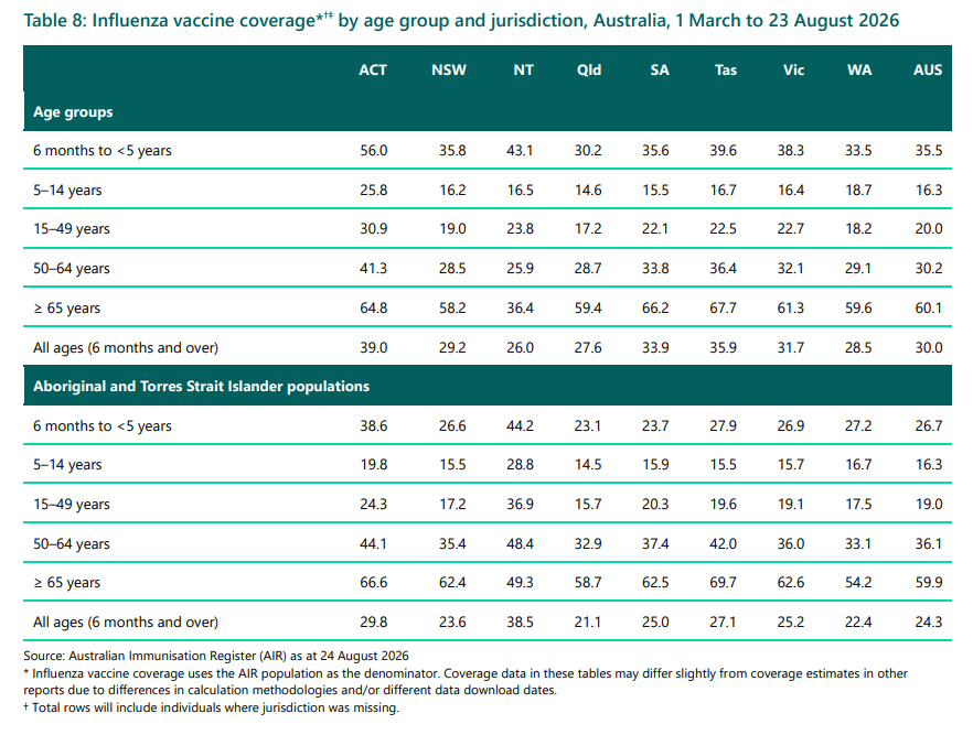
Sadly, vaccination rates among the elderly (60.1%) and the very young (35.5%) are not what they could be to help stave off severe disease in these two groups, where flu hits hardest.
Click on the image to enlarge it.
It also looks like flu is peaking at what used to be a normal time for Australia, but again, we’ll need patience to be sure nothing strange happens in the coming weeks.
Discover more from Virology Down Under
Subscribe to get the latest posts sent to your email.